Exploring the infinite and unexplainable effect color has on our identity, mood, and daily lives.
Subconscious or otherwise, color can evoke emotions, inspire reactions, and radically shift our mode of thinking. It can excite or soothe our moods, raise or lower our blood pressure, and make us choose one product over another. Whether it’s innate or learned, it’s undeniable that color has a vital impact on every facet of our lives.
The psychology of color is based not only on its mental effects but also its emotional effects. Everything from the color we choose to have in our space, to the very color of our surroundings, has an impact on our mood and feelings. Few know this better than Michelle Lewis, the founder of The Color Cure™ and author of Color Secrets. “I’m a Color Psychology Expert who helps people discover the world of color, see how it can support their intentions, and start strategically implementing it in their daily lifestyle,” she says.
There are two distinct categories of color: high frequency and short frequency.
High-frequency colors include red, yellow, and orange, which can heighten a variety of emotions, sometimes all at once. In contrast, short-frequency colors—green, blue, and purple—tend to have calming effects. This is why a lot of gyms use red because it invigorates us. It’s also why blues are used in spaces where we live and work because they can literally lower blood pressure and relieve tension. “I work with a lot of parents who have kids with special needs,” adds Michelle Lewis. “We work specifically on which colors will provide the most connected, calming reaction. For some, it’s orange because it’s very balancing and grounding. And for others, greens or blues can provide a sense of calm.”
Everything, everywhere is speaking to us in color.
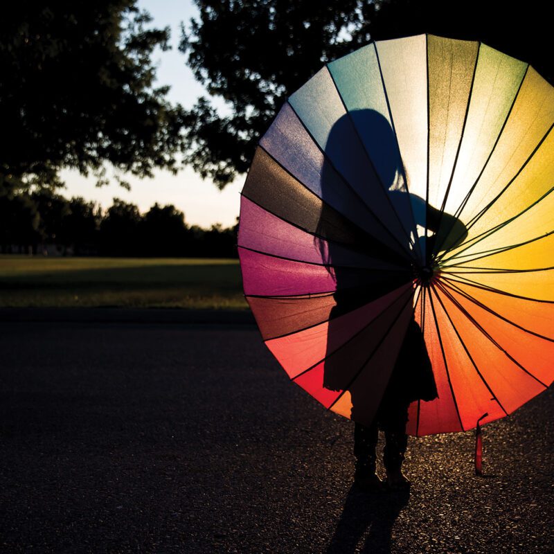
Most humans can see a range of around one million colors, which means our bodies can have millions of reactions.
MICHELLE LEWIS
GROWING UP IN FULL COLOR
At the beginning of life, everything is blurry. We don’t begin perceiving color until we’re two to four months old—just a lot of gray. This is due to our immature retina and nervous system,
which are still in the process of maturing. Then the world starts to reveal itself—first in red and green. By five months, babies can recognize more vivid colors like adults can.
Interestingly, cultural influences can also play a role in babies’ color perception. Research suggests that babies raised in different cultural environments may develop preferences for certain colors based on the predominant colors in their surroundings or cultural norms.
Ever notice the way children are more drawn to bright colors like red, yellow, green, blue, and pink?
Research shows that children tend to prefer bright colors—in part, because saturated colors are easier for young, developing eyes to see. Such colors captivate their attention and stimulate their imagination, leading them to explore and experiment with different hues and combinations. As children mature into adults, the colors of their world get darker and more muted, a “sobering” effect of adulthood. A mix of maturity, work culture, and emotions all agitate this shift in preference.
That said, you have to wonder: Do adults truly love muted colors and different shades of white and black, or are we just suppressing the kid inside of us? “Usually when we’re able to talk a little bit, the doors start opening and people realize ‘Oh, it isn’t childish to love color,’” said Michelle Lewis about her experience working with clients.
Sophistication does not have to mean neutral.
MAKING A MARKETING STATEMENT
In a famous study titled “Impact of Color on Marketing,” researchers found that up to 90% of snap judgments made about products can be based on color alone. In fact, people make up their minds within 90 seconds of their initial interactions with either people or products, and about 62–90% of the assessment is based solely on color. This is why companies spend so much time and resources on the colors expressed by their brand in both digital and physical environments.
Although different colors can be perceived in many ways, the names of those colors matter a lot as well. In one study, when subjects were asked to evaluate products with different color names, such as makeup, descriptive names were preferred far more often. For example, “mocha” was found to be significantly more likeable than “brown,” despite the fact that the subjects were shown the same exact color. Similarly, kids can be drawn toward crayons named things like “Atomic Apricot” over generic names like “orange.”
Some color names even begin evoking an internal feeling, like the 2024 Color of the Year from Sherwin-Williams®—Upward— which the company calls, “A breezy, blissful blue. The color found when we slow down, take a breath, and allow the mind to clear.”
It has also been shown that more unusual and unique color names are preferable for everything from jellybeans to sweatshirts, proving that when color combines with different word or idea associations, it can change everything about our feelings, perceptions, and even the way we spend our money.
With red, our heart rate increases, our pupils dilate, our blood pressure goes up. It makes us want to have a physical response, whereas with purple we tend to get kind of dreamy and even a little lightheaded.
MICHELLE LEWIS
INTO THE WAVELENGTHS
The human eye sees color over wavelengths ranging roughly from 380 nanometers (violet) to 750 nanometers (red). Light within this range is called visible light—or the visible spectrum—because humans can see it. Light outside of is range may be visible to other organisms but cannot be perceived by the human eye. Colors of light that correspond to narrow wavelength bands (monochromatic light) are the pure spectral colors learned using the ROYGBIV acronym: red, orange, yellow, green, blue, indigo, and violet.
Violet light has the shortest wavelength, which means it has the highest frequency and energy. Red has the longest wavelength, the shortest frequency, and the lowest energy. According to Michelle Lewis, this explains a lot. “With red, our heart rate increases, our pupils dilate, our blood pressure goes up. It makes us want to have a physical response, whereas with purple we tend to get kind of dreamy and even a little lightheaded, because it’s the shortest light spectrum color.”
Whether it’s pivoting your home environment to introduce calm and comfort, or leading a revolution for change in your industry, color is a powerful force that exists to support our intentions. It’s so much cooler than science fiction. Color is a science that will rock what you know about the world around you, down to your very core. It will even change how you speak. In fact, color is affecting you right this very second.
So then comes the question. Are you paying attention?
The wavelengths of visible light are:
• Violet: 380–450 nm (688–789 THz frequency)
• Blue: 450–495 nm
• Green: 495–570 nm
• Yellow: 570–590 nm
• Orange: 590–620 nm
• Red: 620–750 nm (400–484 THz frequency)
The Magic of Magenta
Magenta is sort of pinkish-purple, but there’s one big problem. It doesn’t exist. Red and purple are on opposite ends of the spectrum, so on the color wheel, they naturally fade into one another. So, if it doesn’t exist, why can we see it? Again, on the spectrum of elements, all visible colors (and nonvisible rays) have specific wavelengths that distinguish them from other colors on the color wheel. Magenta, because it doesn’t exist on the light spectrum, doesn’t have one. Rather, it’s something our brain creates to fill in space in a way that makes sense.
