We see and feel color everywhere.
Wherever we go, whatever we’re doing, inside and out, color gives us an emotional reaction. Some combinations are bold and joyous. Others are soft and soothing. Some combinations get there by chance. Others, by choice—careful, time-consuming choice.
There are infinite colors in this world, ten million of which the human eye can actually distinguish.
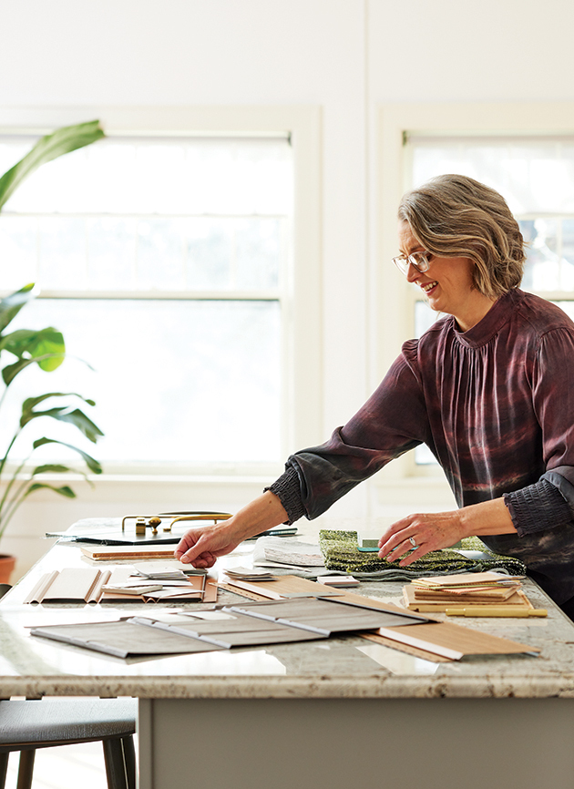
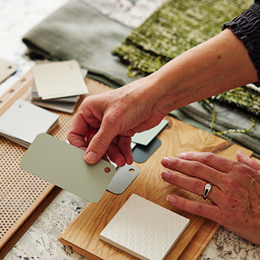
And when you consider all the different possible combinations? Well, now you’re back to infinity. So, although you can look at a home, or a clothing line, or an office, or a consumer product and say, “Yeah, those colors make sense,” you’re probably observing colors that someone agonized over, exploring different colors until they found the ones that were just right. As a color, material and finish (CMF) consultant, this is a process Kerry Rowe knows all too well. “When the sky’s the limit with infinite possibilities, it’s easy to be overwhelmed,” she explains.
Kerry has been a CMF consultant since 2009, helping leading home product companies create and maintain their standard CMF lines. “Sometimes I’m brought in at the beginning to create foundational color collections, but most often I’m pulled in to help make sense of a legacy offering of products, reconcile existing products and introduce new colors based on market expectations,” she says. “I have always loved color and putting things together to create amazing spaces that improve homes and make homeowners happy.”
”I have always loved color and putting things together.
Kerry Rowe, Kerry Rowe Design
An Emotional Matter
Color trends are rooted in various aspects of society—entertainment, fashion, social media, nature, science, etc.—and they are constantly shifting, transforming, capturing senses of nostalgia and stirring our emotions in unexplainable ways. Some color trends make sense, while others defy logic completely. “We’re in a very interesting time for color preferences,” says Kerry. “With the pandemic still going on and the economy and supply chains in flux, you’d think color would be subdued and dark, but the current, prevailing color trends are bright and fresh because we need them to be! We want colors that stand out and exude optimism and positivity in a time when in-person connections are not back to pre-pandemic standards. Color is tied to emotion and has the power to uplift us in this moment when we certainly need it.”
”Color is tied to emotion and has the power to uplift us.
Kerry Rowe, Kerry Rowe Design

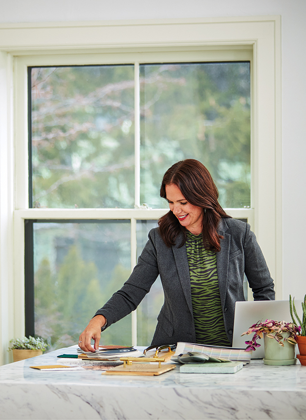
Michelle Bjorum & Kerry Rowe
Trends Worth Watching
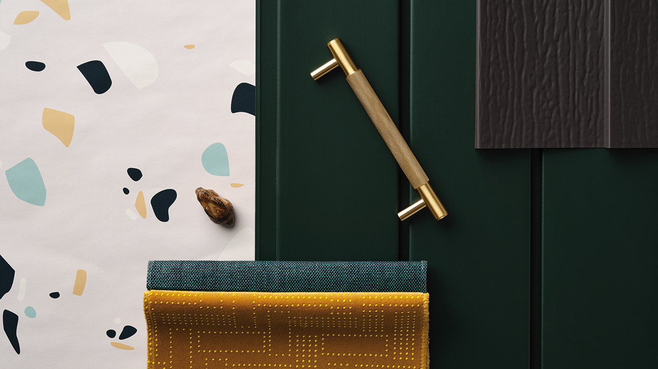
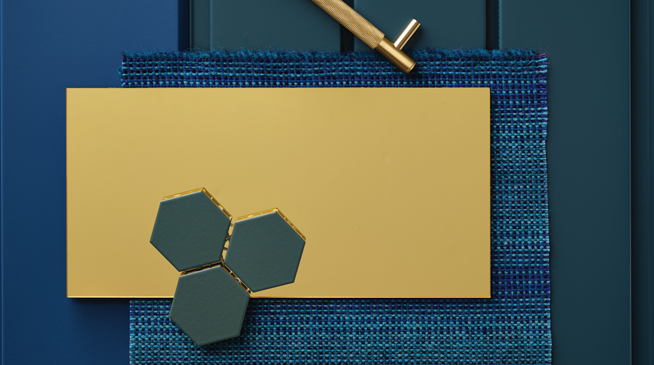
As Kerry mentioned, bolder colors and patterns are on the rise—colors that carry a sense of positivity and joy. Along with bold colors, designers are also seeing trends of nourishing neutrals replacing stark whites, and warm taupe replacing designer gray. But design trends don’t always manifest in the color alone. Sometimes it’s the combination of colors with textures or materials. “Velvets are continuing to explode,” Kerry explains. “The ‘cozification’ of our homes has many specifying velvet and plush upholstery—the softer the better.”
Michelle Bjorum—an interior designer and owner of Home Joy Studio who helps clients across the country—also confirms the takeover of texture. “More than any specific color trend, I’m excited about texture trends,” she says. “In the world of exteriors, the availability of different profile options such as the planked look, multiple types of board and batten, shakes, smooth surfaces and woodgrain texture—they provide so much opportunity for customization, even when clients prefer sticking to ‘safe’ colors.”
2021 trends point toward divergent paths. We crave colors that are upbeat and happy. However, these touches of vibrancy require a steady foundation of warm, cozy neutrals that communicate security and stability. Key color families for 2021 are active and bright as well as subdued and calming. Both categories are important. Both are valid and set out to balance each other, and maybe us in the process.
(An excerpt from “Personalities of color, materials and finishes”—a blog post on Kerry Rowe’s BOX SEE blog.)
Color trends tend to skew inside-focused—paint, furniture, fixtures, etc. But Michelle Bjorum believes outdoor living shouldn’t be overlooked. “A home’s exterior is the backdrop for appreciating your outdoor spaces and shouldn’t be ignored,” she says. “While I think neutrals will remain the baseline for overall color schemes, what I’d love to see as a trend is carving out smaller sections on the exterior elevation where accent colors are used to accentuate outdoor living spaces. In order to push the color boundaries, starting small or perhaps in backyard patio areas may be a low-risk way to reintroduce homeowners to color on their exteriors.”
”A home’s exterior is the backdrop for appreciating your outdoor spaces and shouldn’t be ignored.
Michelle Bjorum, Home Joy Studio
Updating Every Element
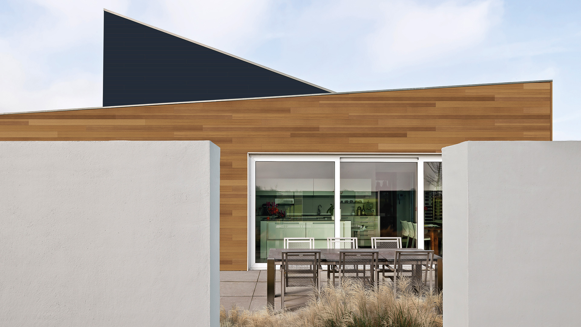
In the fall of 2018, Tim and Courtney Heinrich purchased a home that had been on the market for three years. Despite the idyllic location, it had been used as a vacation rental property for about 20 years. As a result, much of the love and attention that would normally go into a home… hadn’t. “We went as far as to explore a complete knockdown and rebuild since almost every element of the home is being touched,” Tim remembers.
First and foremost, some safety concerns needed addressing—leaking windows, broken siding and rotten trim. Once those were taken care of, the couple started thinking more about possible design approaches, but kept getting stuck. “We struggled with the opposing roof lines and overall boxy shape, and knew that we needed help,” Tim says. And for this, Tim and Courtney looked to Michelle Bjorum and Home Joy Studio.
The three made a fantastic team. Michelle provided examples of past work and a summary of her services. Tim and Courtney shared inspiration they’d spent years collecting, including a few options they wanted to start with regarding colors, accents and orientation. Within a few weeks, Michelle provided six renderings, each with distinctive features and inspiration. “We worked through combining elements from one to another to come up with our final selection,” Tim says.
Tim and Courtney’s home is still a work in progress. But they did map out a ten-year plan that balances functionality, cosmetics and safety—and they’re getting there, bit by bit.
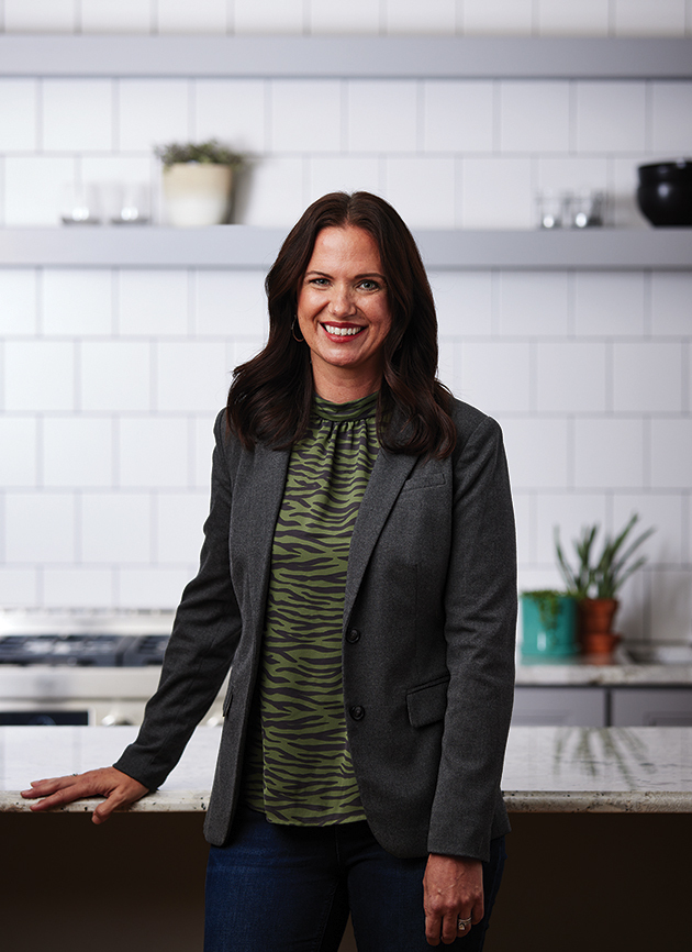
Kerry Rowe
CMF Consultant / Kerry Rowe Design
A sound CMF strategy can make or break a new product introduction. Similarly, a CMF program refresh, grounded in effective sensory appeal, strengthens your brand and your customers’ emotional response to your products. Learn more about Kerry, see her services and read her blog at kerryrowedesign.com or follow @kerryrowedesign on Instagram.
”I absolutely love to clean up a dated color line, reducing the number of colors offered in a more concise, curated line.
Kerry Rowe, Kerry Rowe Design
Cabin Design Fever
Tim Kvech had been waiting all his adult life to build a hunting cabin. Finally, he chose a piece of property—the perfect retreat for family and friends. Tim really wanted a “wow” factor, but achieving it was another story. “I had an architect provide the home plans, but my challenge was envisioning the siding design and color scheme to blend in with the natural surroundings,” Tim says. That’s when he was referred to Michelle Bjorum. “She and I discussed what I was looking for and then she sent me several design and color options,” Tim says. “She took my exact home plans and visually showed me each option on my home which then made it extremely easy for us to decide which option we liked best.”
This is something Michelle always does—showing her clients what the final home will look like. “There’s nothing more powerful than being able to see what you’re getting yourself into!” she asserts from experience. “Designers typically have the ability to visualize quite clearly what something would look like based on notes and samples and photos, but not everyone can make the leap from that little color swatch on the dining table to a full exterior refresh, which is totally understandable.”
Color played a huge role in the outcome of Tim’s cabin getaway. Inside and out, his vision was having a place people would rave about. And, as he puts it, he couldn’t have done it without a designer by his side. “Hiring a designer and investing in a design rendering provided me with a huge return, and the house design that I always dreamt about.”
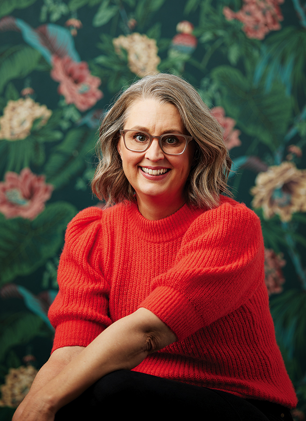
Michelle Bjorum
Interior & Exterior Designer / Home Joy Studio
Home Joy Studio believes your home should bring you joy, fulfill a purpose beyond simply being a roof over your head and should be a place of comfort, rest and rejuvenation. Learn more at homejoystudio.com or follow @homejoystudio on Instagram.
”Homes—both inside and out—are the stage where the stories of our lives unfold.
Michelle Bjorum, Home Joy Studio