When you Google a local business, what’s the first thing you see in the listing? Probably an exterior photo. At least one, maybe more.
Every year, billions of people search for restaurants, gyms, banks, auto dealers, and other companies that inhabit commercial spaces. And the first impression is usually a photo saying, “Hey, here’s what we look like from the outside.”
GOOGLE GETS IT
In Google’s Help Center article titled Tips for Business-Specific Photos on your Business Profile, Google recommends adding at least three great exterior photos to help customers recognize your business—right in the very first tip. Google also tells business owners to 1. Capture a photo from each direction that customers might approach your business and 2. Try uploading photos that show your business at different times of day.
You’re selling an image of what your business is ... and we took that to heart.
MICHAEL VISSER, ADVANTAGE COMMERCIAL REAL ESTATE
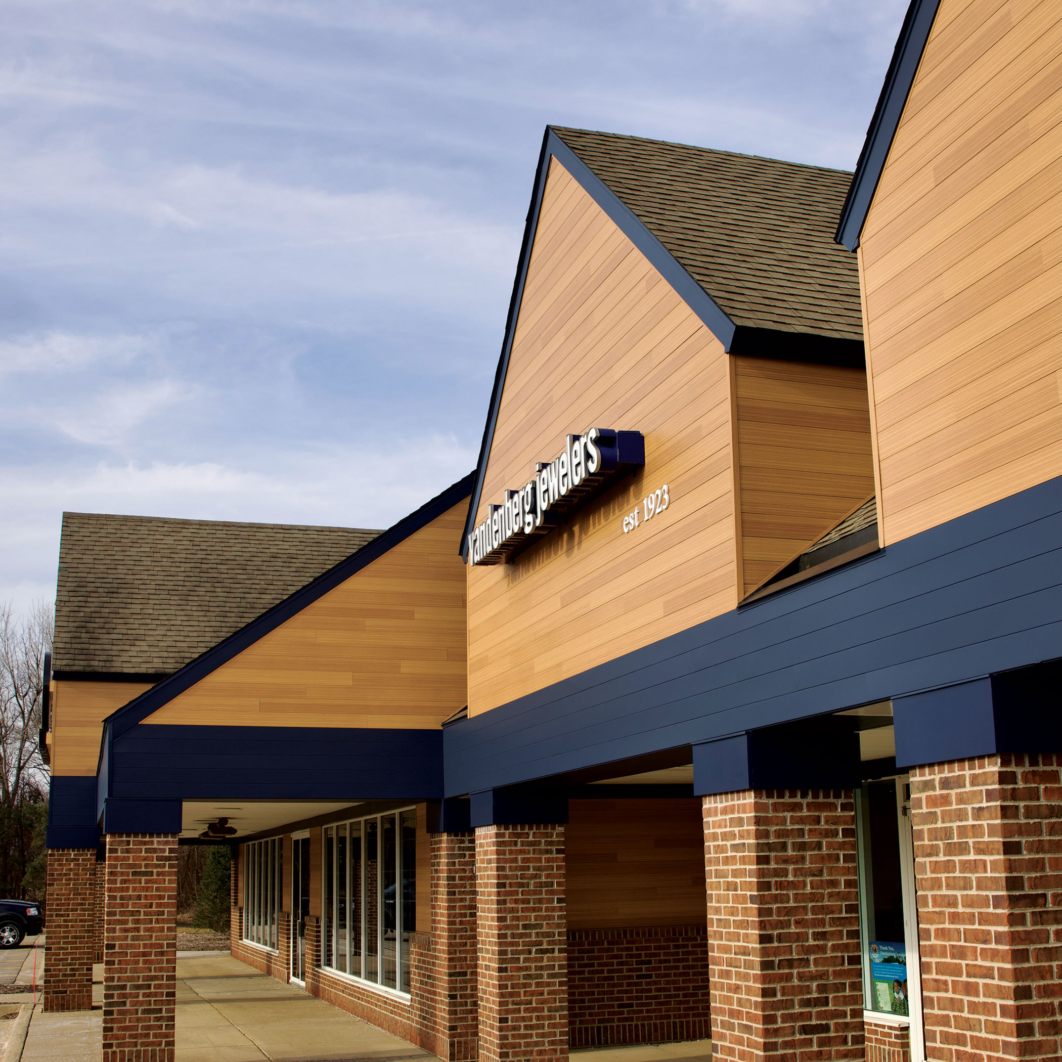
GAINING AN EXTERIOR ADVANTAGE
When Tom Vredevelt, a commercial real estate developer and investor, and Michael Visser, the co-founder of Advantage Commercial Real Estate, teamed up to purchase a building originally constructed in 1990—one that was very much showing its age—they had a simple question for its renovation: “What’s going to give us the biggest bang for our buck?” That question led them to Vesta Steel Siding® from Quality Edge. “Bringing the building into 2024 was a value we could add as an ownership group that the previous owners didn’t,” said Tom. “That was an opportunity we couldn’t pass up.”
Whether it’s a large retail brand, a small healthcare practice, or anything in-between, tenants are looking for more than just a space for their business. Like a home, their building needs to be a place of pride. And that’s what Tom and Michael helped create. “You’re selling an image of what your business is,” says Michael. “And we took that to heart.”
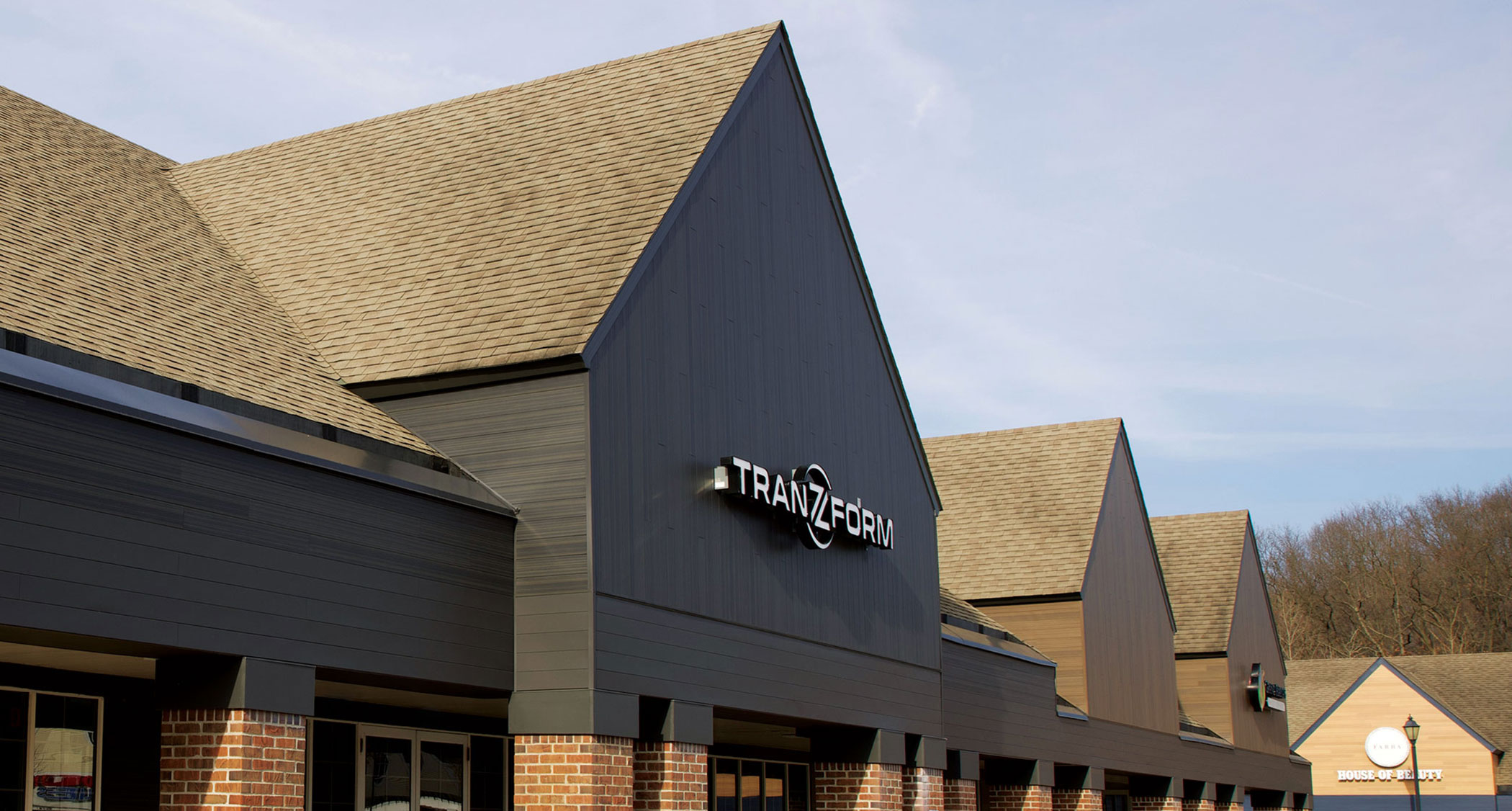
The exterior investment gave tenants a place to grow their business and a way to tell their story, but for Tom and Michael, it was also about the raw numbers. “The cost of maintenance has never been higher,” said Tom. “What really sold us on Vesta Steel Siding was the one-time investment due to the durability and low maintenance. Not having to spend dollars down the road on paint and maintenance was very attractive.”
At their core, Tom and Michael are investment-driven. When they invest in a space, they’re looking to revitalize the building and create a sense of community—not just monetize an asset. It’s about the impact it makes in people’s lives. Yes, it’s about curb appeal. But really, it’s about so much more. And it shows.
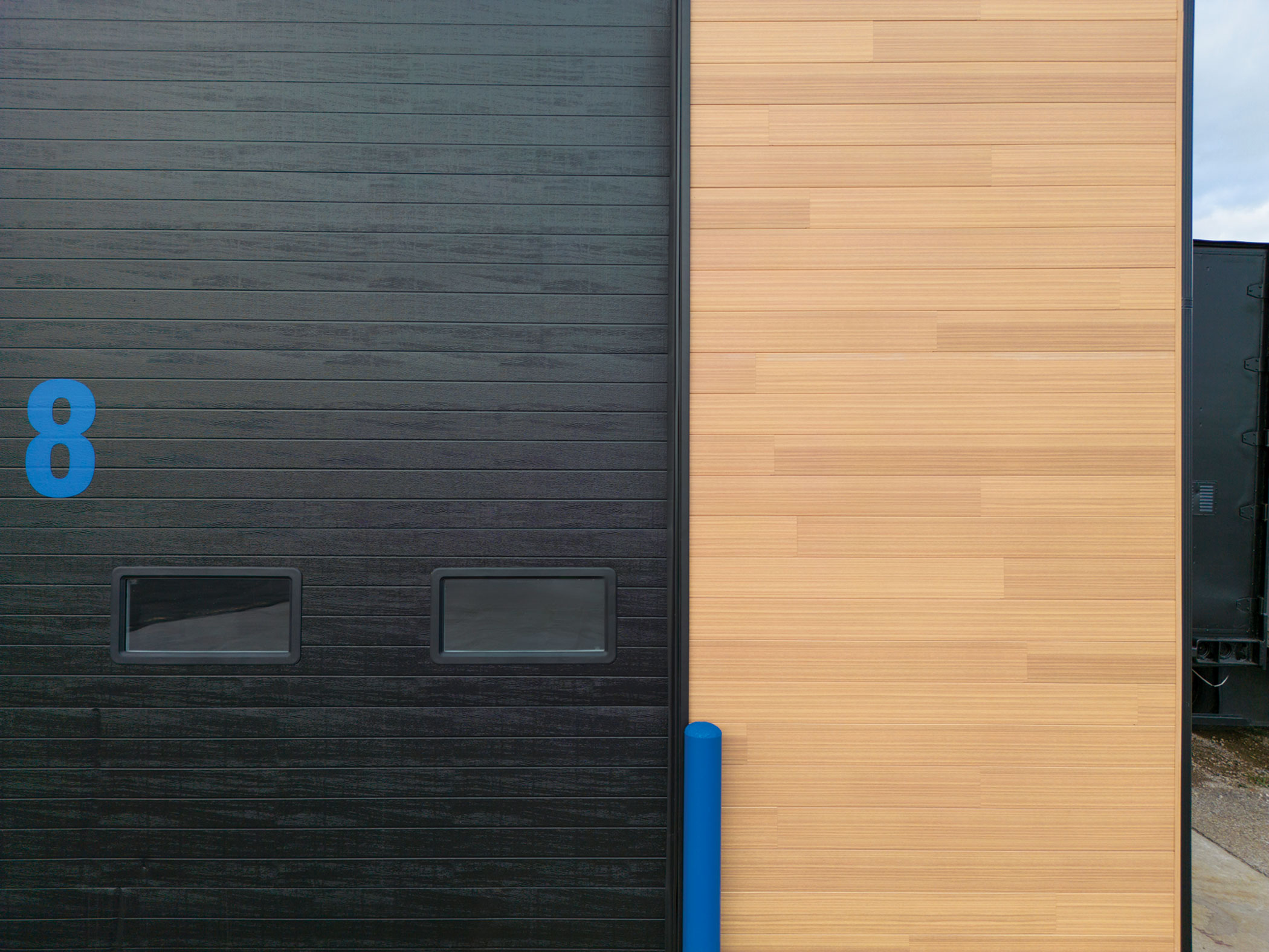
The newly renovated space also sparked a new use for the building. “It has allowed us to offer trainings for installers now that we have the space to further train and teach their craft. And that’s just great for our industry,” Deb adds.
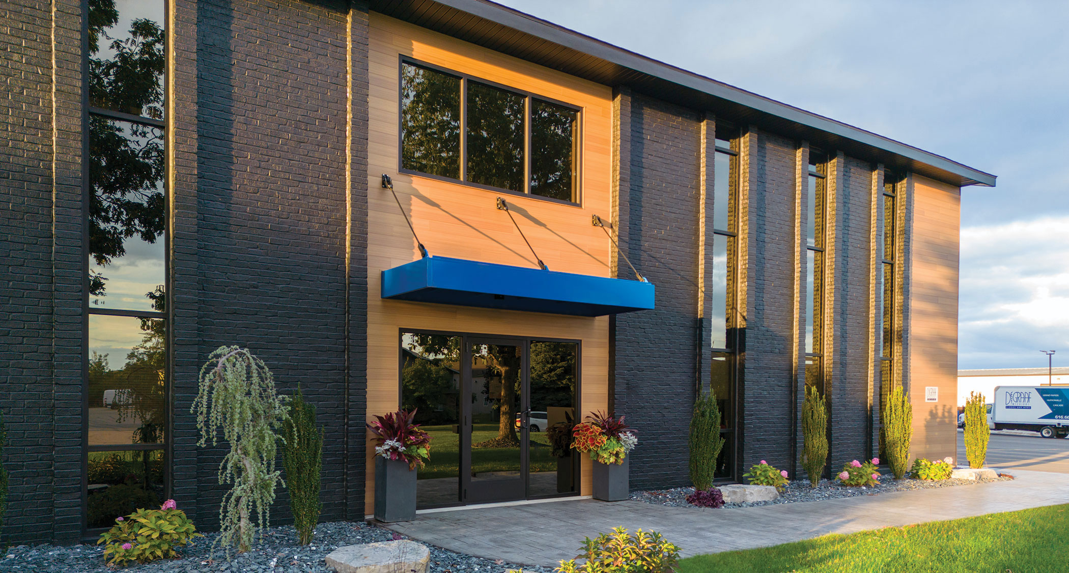
Between the siding, the interior design, and even the brand’s signature blue that shows up everywhere—from the meeting rooms, to the loading docks, to the front overhang—everything came together to tell a better story of DeGraaf Interiors and showcase how much it cares about its business, customers, people, and future.
“The comment that most people make is that we finally grew into ourselves,” Deb says with a smile. “If somebody looks us up online, DeGraaf looks the way I always envisioned it.”
